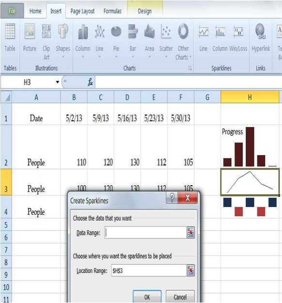
Excel 2010 has a new feature called a sparkline, which is a micro chart within in a single cell. In previous Excel versions, when a user wanted to show a chart, it was usually a fairly large chart on its own sheet or a section of a sheet. Excel 2010’s sparklines are very different. They quickly and visually summarize data in a very small effective area. You can also add some text in the same cell with the sparkline. This is convenient when trying to swiftly present information with simple but compelling data.
Here’s how to do a sparkline. Enter or pull up a sheet with rows and columns with data similar to the screen shot. To setup a sparkline highlight the desired cell location go to Insert> Sparklines and click the Line, Column or Win/Loss chart icon. Line and column are the most common charts, while Win/Loss is a positive/negative chart. In the Create Sparklines box, choose the data range where the data is located and the Location range for where to place the sparklines. For instance, in this screenshot the data range would be JUST row 3. NOTE: You cannot select all the data in this excel sheet for one small chart, only one row at a time. Click OK, then you can type helpful text in the sparkline’s cell.
This brand new Excel feature helps spreadsheet creators with a new way to illustrate numbers in a sheet. A sparkline allows a chart to be in a very small area yet still make data much more readable. It’s very easy to create these charts and the ability to add background text that explains the chart is a great feature.


